Planning: 20/20
Film: 26/40
Poster: 7/10
Radio advert: 7/10
Evaluation: 15/20
Wednesday, 12 May 2010
Monday, 10 May 2010
Friday, 30 April 2010
Wednesday, 17 March 2010
Planning grade: 20/20
WWW:
Planning for this project was excellent. You worked really well in a team with Grace again this year and you planned carefully every step of the way as evidenced by your posts. Well done.
Planning for this project was excellent. You worked really well in a team with Grace again this year and you planned carefully every step of the way as evidenced by your posts. Well done.
Friday, 12 March 2010
Poster Advert
Tuesday, 9 March 2010
Evaluation Proposal
For my evaluation, I am planning on creating it by speaking into a video camera and then editing the footage using the programme "Final Cut." I will edit the footage using different transitions and effects when talking about the different stages that I went through. These stages will include the different ideas that I initially thought of and why I chose my finaly idea. Using the video camera will make my evaluation very creative and I can use further effects such as putting music in the background and also adding in different print screens of the coursework as it was being made. This could include shots of the story board being shown on screen with me talking in the background.
I think that choosing to do my evaluation in a video format is the best option because it offers a range of different features that I can use, this gives me further practice of using programs that established professionals use in there careers. Furthermore, I can get my points across in the best and most clear way as I will be speaking directly.
I think that choosing to do my evaluation in a video format is the best option because it offers a range of different features that I can use, this gives me further practice of using programs that established professionals use in there careers. Furthermore, I can get my points across in the best and most clear way as I will be speaking directly.
Poster Planning

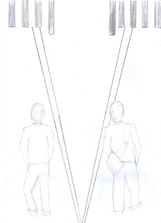
The picture above is the design for the picture we want on our poster. The picture is of two boys walking, but on different sides of the road. the boys in the poster are the two characters from the film and they are on different sides of the road on purpose to show how they dont not know each other and both live different lives.

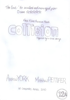
The second drawing is the design of what is going to be included on the poster. There is the title so the audience know what film the poster is advertising. There is also a review from a leading tabloid paper and a star tating- this is important because the audience can see how the film is rated so they can decidee if they want to watch it. There is the age rating inthe bottom right hand corner, this has been used as it is conventional because every film has an age rating. Furthermore, the two actors names have been included because this once again follows the normal conventions for film posters
Subscribe to:
Comments (Atom)

